The Brief
Redesigned to increase Sales and improve the Ux of the app
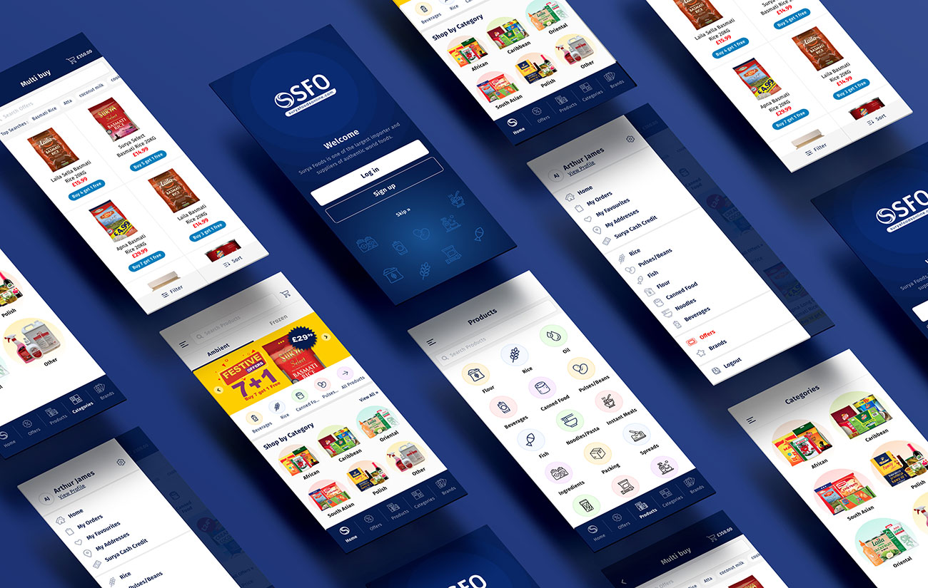
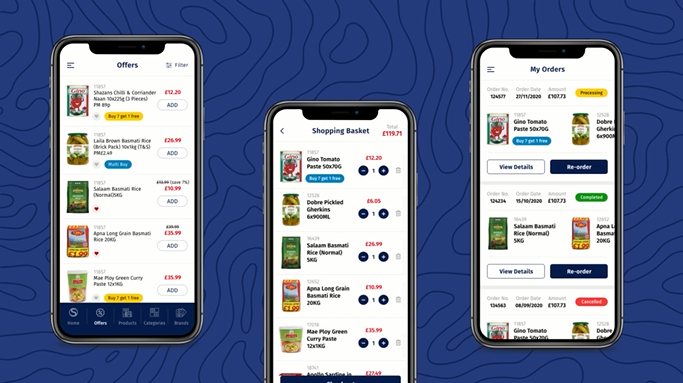
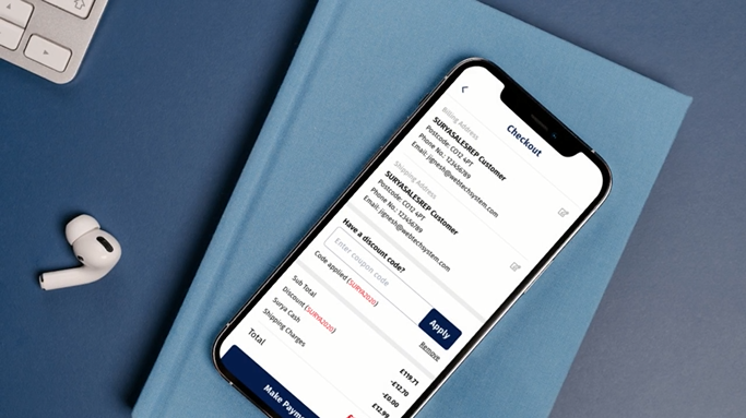
The task was to improve the flow of the app and make it more user friendly for B2B users. It would not be a complete overhaul but to help generate more sales by e.g pushing products at the checkout stage. The current platform generates millions in revenue hence its important.
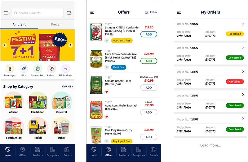
Wireframes
Boosting Sales and UX with Improved Product Visibility and Checkout Features.
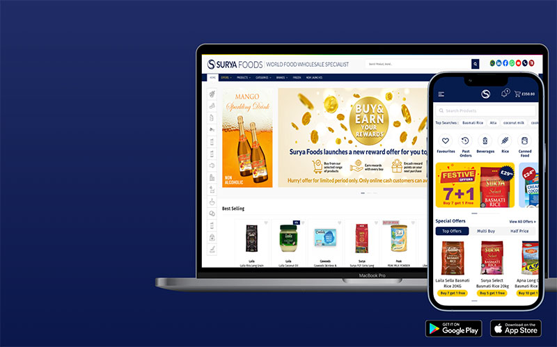
There are a range of current issues with the app such as products not coming up during search resulting in people clicking off. There are also not many function which help generate more sales e.g showing similar products during checkout so I will be implementing a range of those help boost sales and improve the UX of the app.
Current Design
The Problem
Tackling problems in B2B Redesign
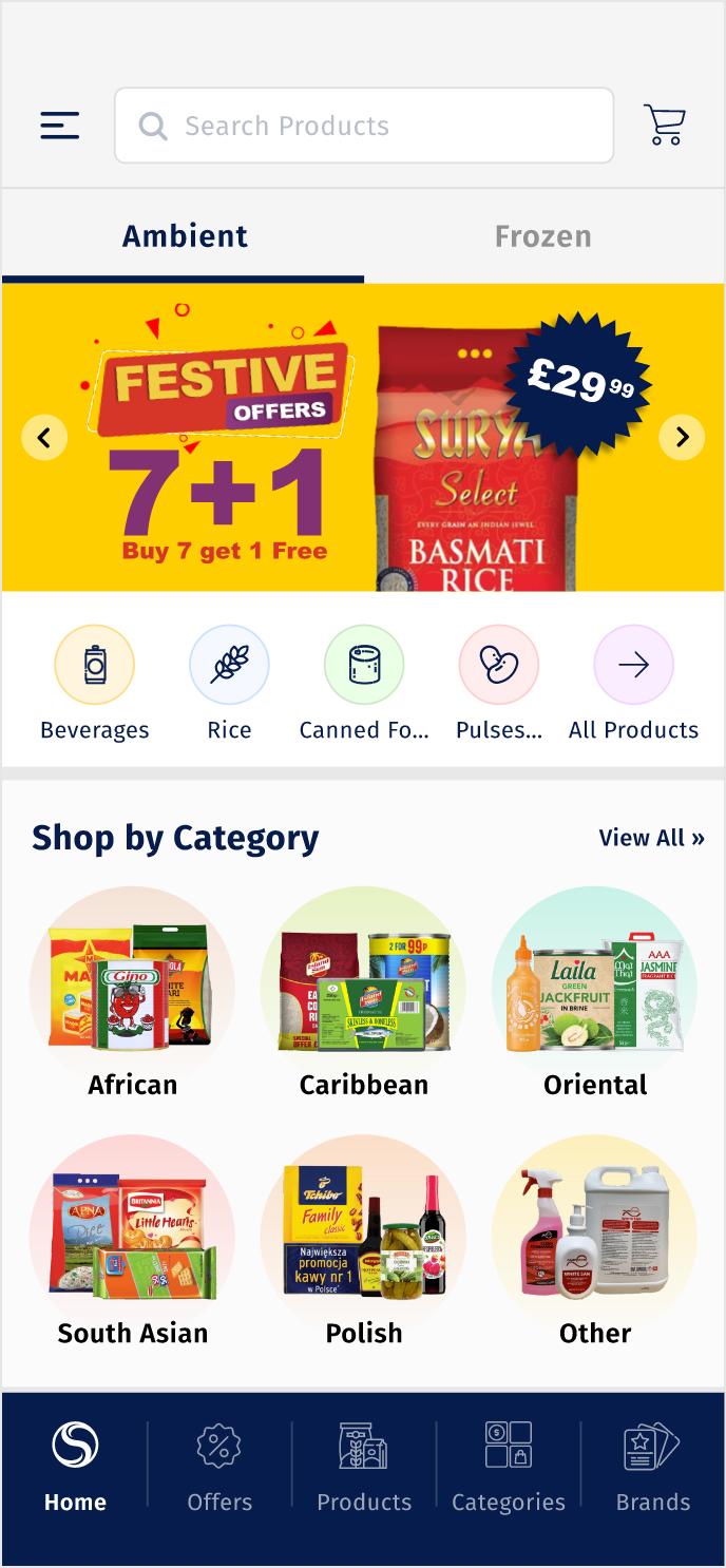
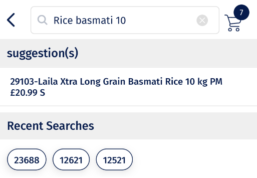
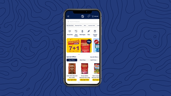
- The existing app lacked a search function, hindering B2B users in quickly finding the products they need.
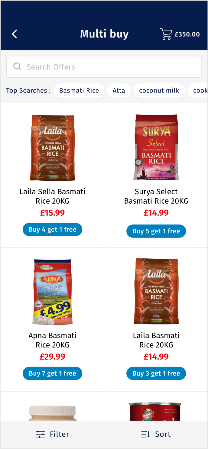
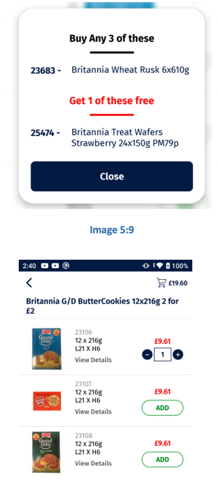
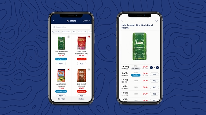
- To stimulate more sales the current app lack an offer features to motivate the consumer to buy more.
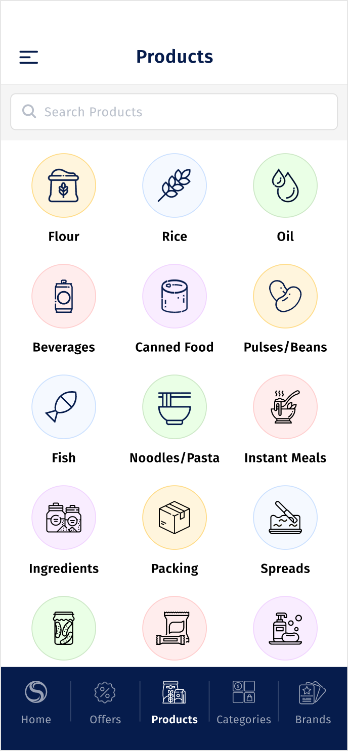
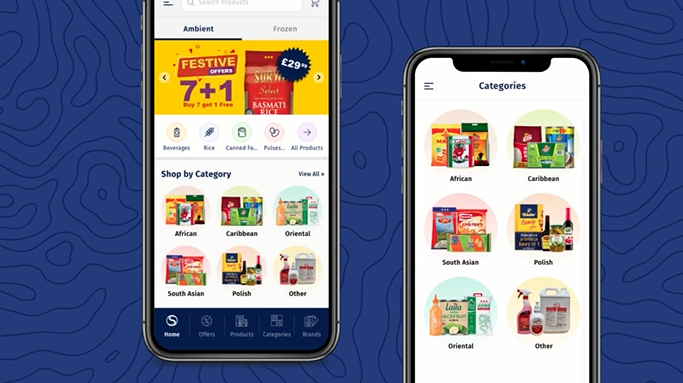
- The original app lacks categories, potentially causing confusion for users. I am to restructure this to provide a more intuitive and organised navigation experience.
- The previous inconsistently categorised frozen and ambient products leading to user confusion especially when they planned to buy from both categories. I am to streamline this and implement a unified approach.
My Role
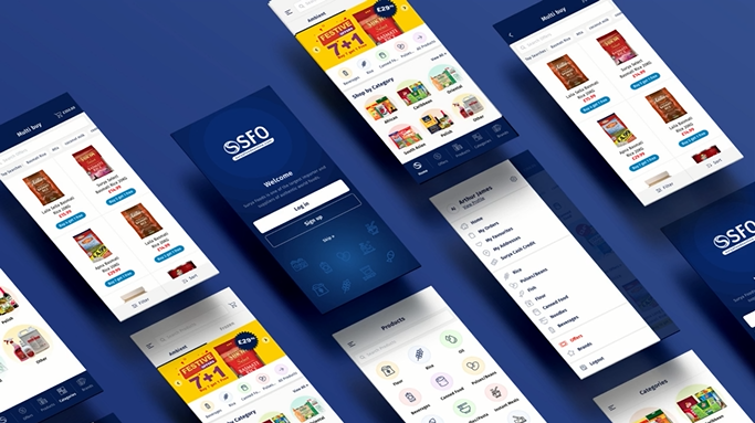
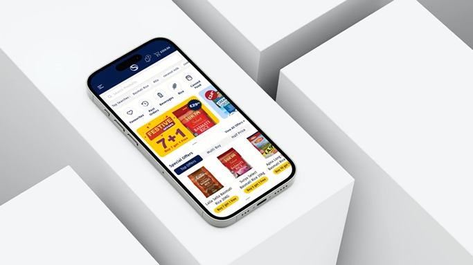
In my role, I led the redesign of the SuryaOnline B2B app. Starting with wireframes, I crafted a user-friendly layout. Once approved, I redesigned the app, introducing features to boost sales and improve the UX for B2B users.
Discovery
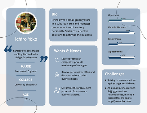
User Persona
WIREFRAMES
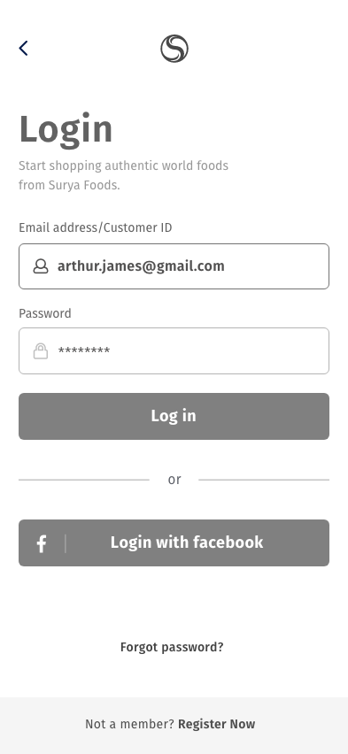
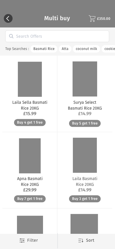
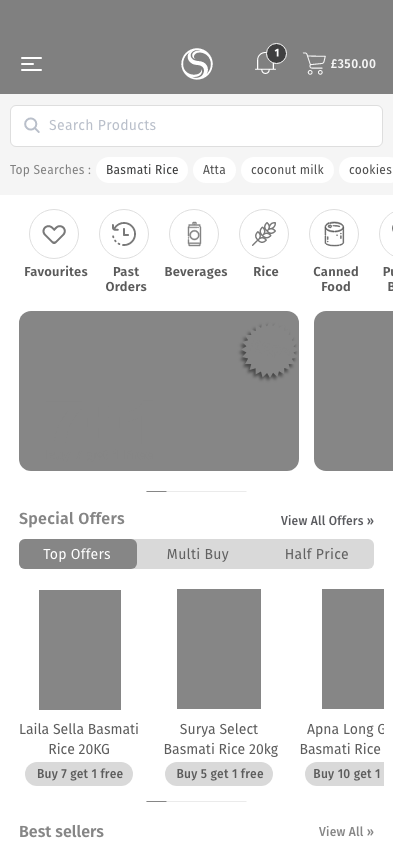
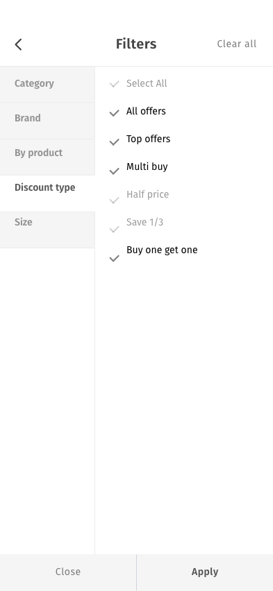
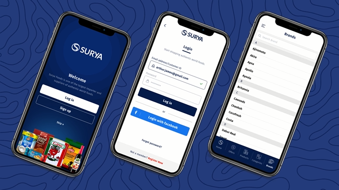
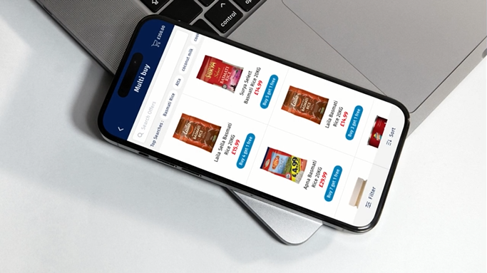
To start of I created wireframe based on the initial design. This featured a new login page and an updated nav bar with search function. A new Multi-Buy page was also created to help generate more sales.
