The Problem
Unveiling the Transportation Challenges of Sports Fans Attending Matches
Sports fans encountering high travel expenses and environmental impact while attending matches are faced with a prevalent challenge. This issue prompts the need for a viable solution to address transportation costs and ecological concerns
The Problem
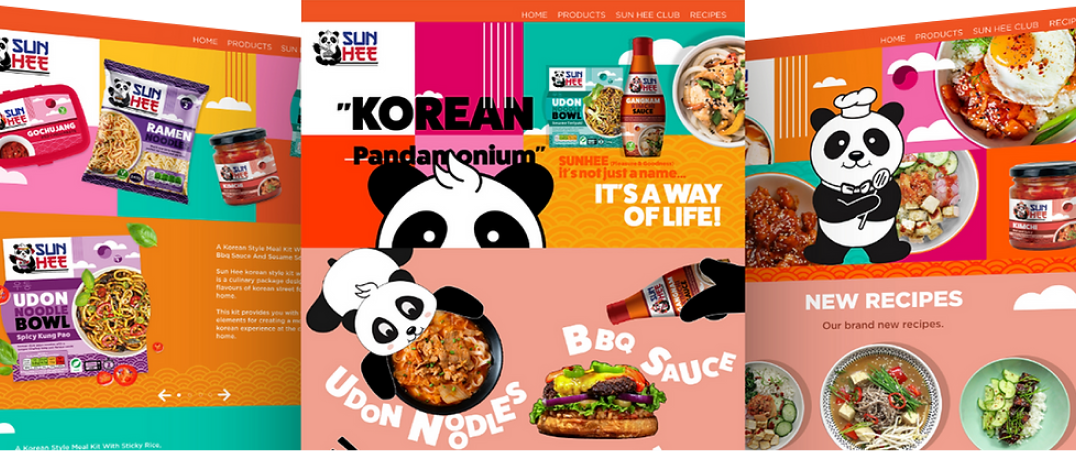
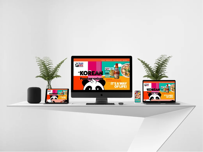
Crafting a vibrant, engaging website for SunHee’s redesign approach.
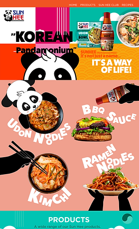
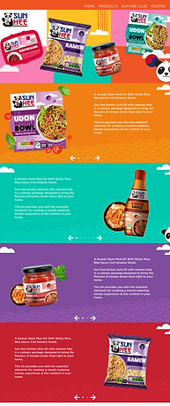
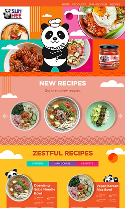
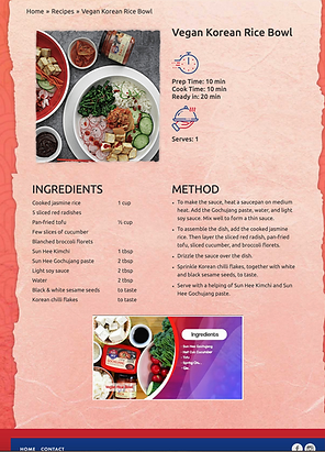
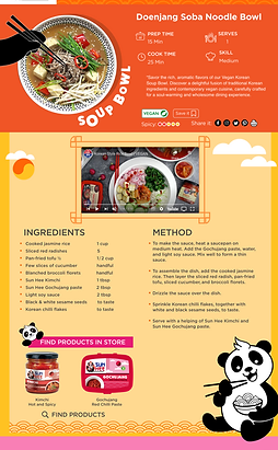
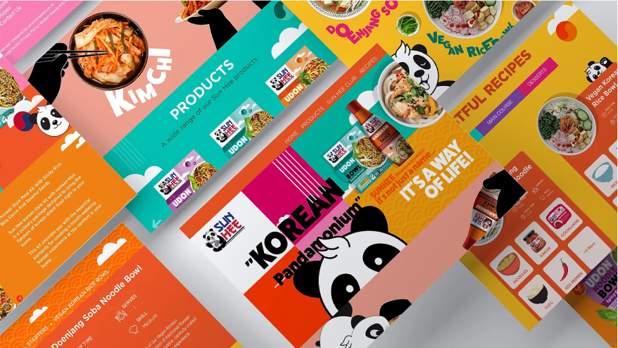
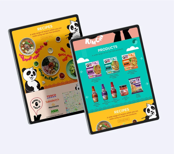
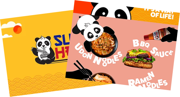
The main challenge was to redesign the website so that the younger audience are engaged to keep viewing the website rather than closing it. The vivid colours (from the packaging) should also be reflected on the website and the mascot of ‘panda’ used throughout to reinforce users.

I aimed to embrace lively, attention-grabbing colours in our design theme to match the brand’s vivid product branding.
Research
Survey
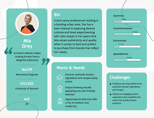
We conducted an online survey targeting our primary audience, aged 18-35, to gather insights on website usability and features. With over 100 responses, this valuable data guided us in aligning functionalities with user needs and expectations.
Survey Findings
The result suggested users wanted a visually appealing website which would keep them engaged, inform them of the range of products we have and consumer generated ‘recipe’ videos to show what they can do with our products.

Make it visually
more appealing

Have user Generated
recipe videos

Add more
colours

Better use
Of fonts
Design
Wireframes
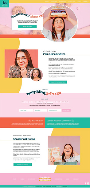
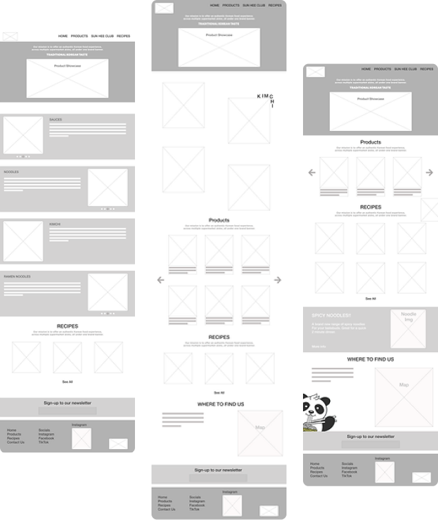
Keeping in mind the current layout, various layouts were created by me which were later tested to see what people though would work best in terms of the UI. Wireframe 2 was chosen as it had the most scope of being playful with the colours and would be more interesting for the users to browse.
Website Research
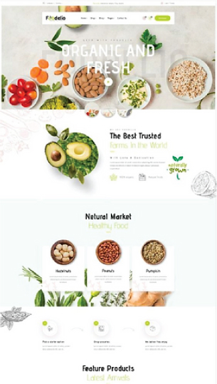
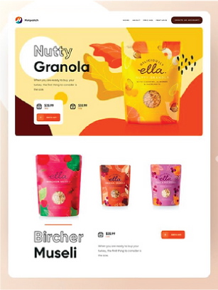
Keeping in mind the current layout, various layouts were created by me which were later tested to see what people though would work best in terms of the UI. Wireframe 2 was chosen as it had the most scope of being playful with the colours and would be more interesting for the users to browse.
Testing
AB Testing was carried out for impactful design and user engagement
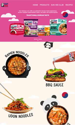
A/B helps identify which design, content, or feature resonates more with users, aiding in optimising user experiences and achieving better outcomes. Two homepage versions were created and AB tested to see which work better. Design A was selected and more pages were created with similar design.

Testing Results
bold type.
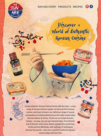
Old vs New
UI Elements
Color Palette
Primary

Secondary

Typography
- Header 1 Montserrat Black - 100px
- Header 2 Montserrat Black - 100px
- Header Sub Heading Montserrat Black - 100px
- Body Gotham Medium - 30px
Elements

Logo

Icons
Conclusion
Being part of the SunHee website project was truly thrilling, and I’m genuinely delighted with how it turned out.
The feedback received for the live website has been really positive. It’s aimed at attracting 15-20% more audience compared to the previous website, thanks to its increased engagement and visually appealing design.
