The Brief
Improving Gym experience for uni. students by enhancing functionality and engagement of SportBrighton app
University of Brighton aims for a student-centered gym app. The app should simplify gym session bookings, offer pitch reservations for various sports, improve current annual membership sign-up process, and provide workout video tutorials for an enriched fitness experience.
The Problem
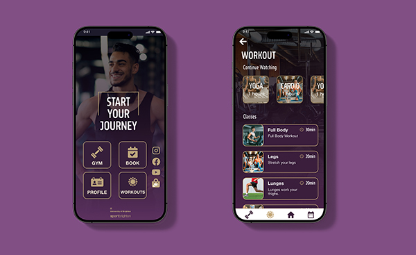
Revamping SportBrighton’s Gym App for an Enhanced Workout Experience
- Firstly, the app suffers from inconsistent organisation, making it difficult for users to understand the information architecture and find the desired features
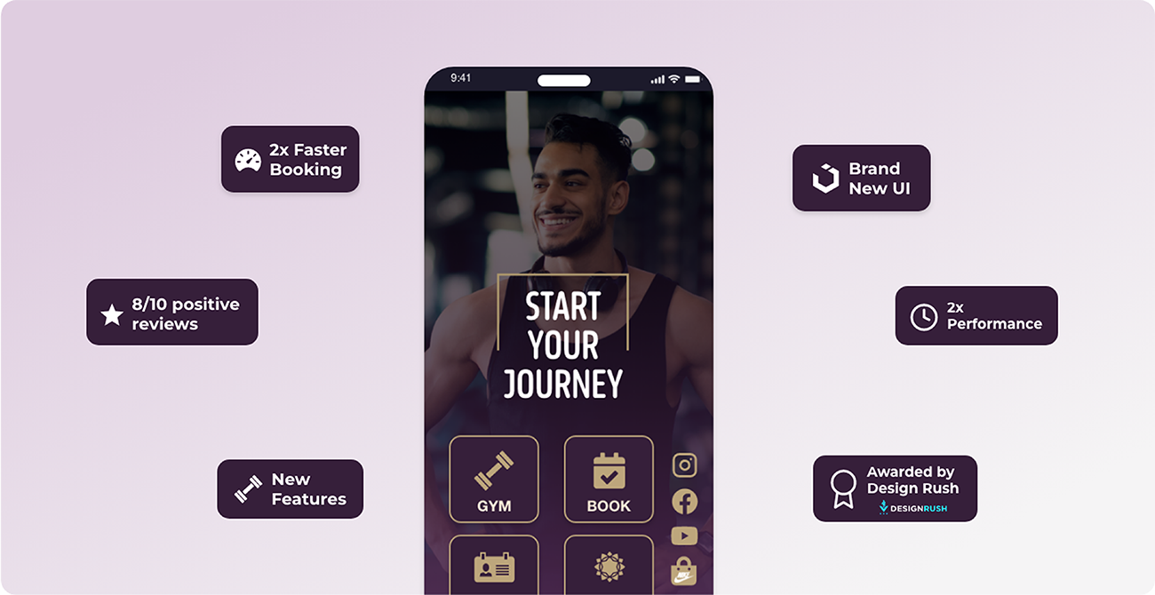
- The app faces branding issues, which may affect its recognition and trustworthiness among potential users.
- The design of the app is subpar, lacking visual appeal and intuitive user interface elements.
- Another significant concern is the app’s slow performance, leading to frustration and delays in accessing information and bookings.

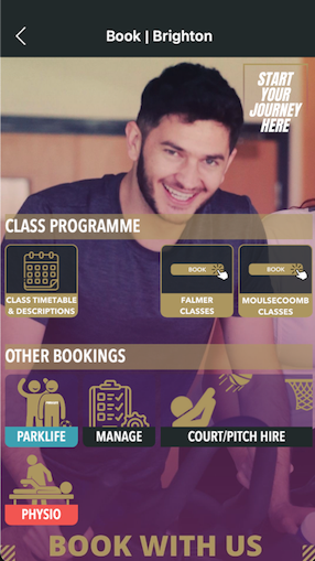
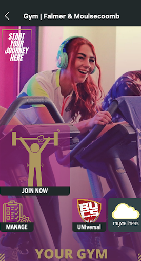
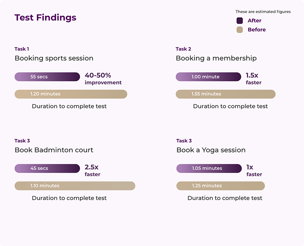
I conducted formative testing, employing methods like usability testing and task-timing, to highlight app issues and user challenges.
Formative Testing
Usability Testing
Conducted usability testing with a diverse group of four users, including regular university gym-goers and users of other gym apps, to identify app issues. Tasks focused on core functionalities, totaling an average of 5.3 minutes per user. Supplementary methods included questionnaires and System Usability Scale (SUS) evaluations. Identified areas for improvement: prioritise enhancing homescreens and refining booking processes for a more intuitive user experience, particularly in membership bookings.
Wireframes
Revamping SportBrighton’s Gym App for an Enhanced Workout Experience
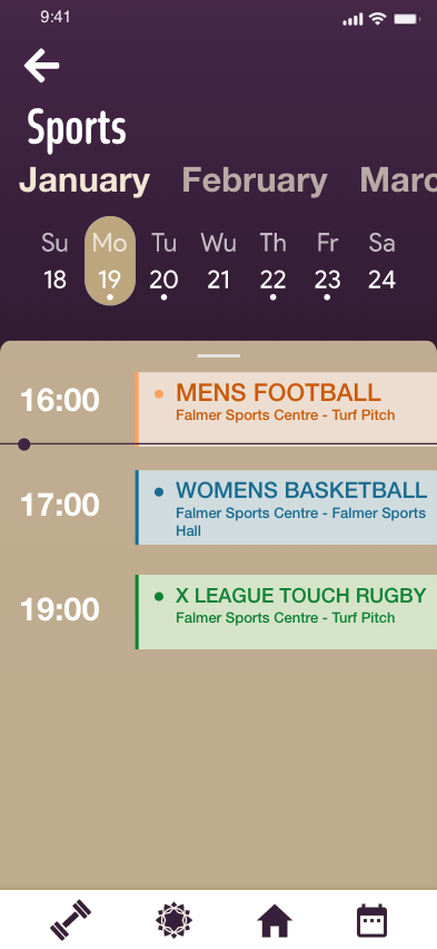
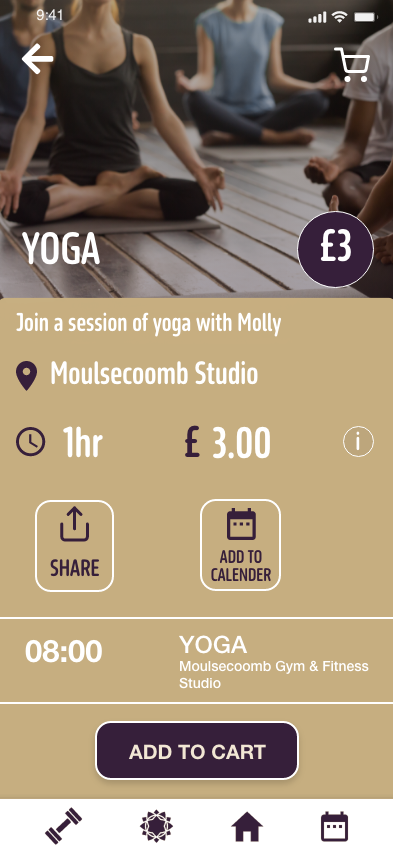
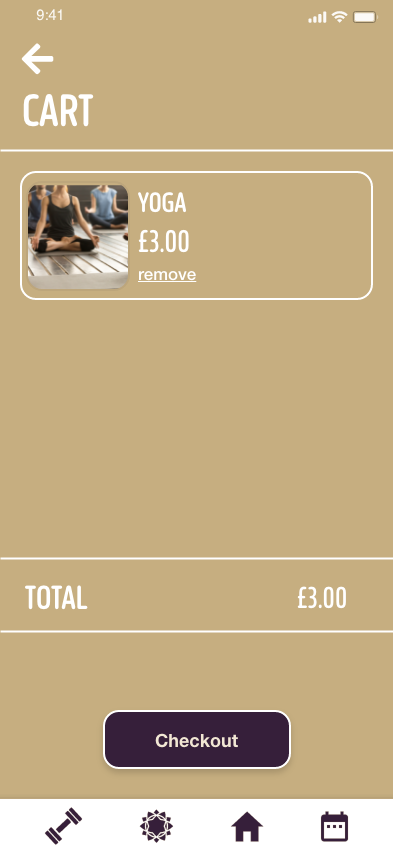
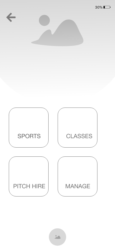
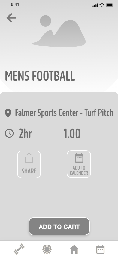
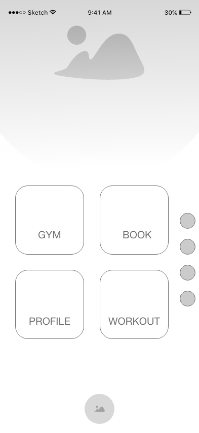
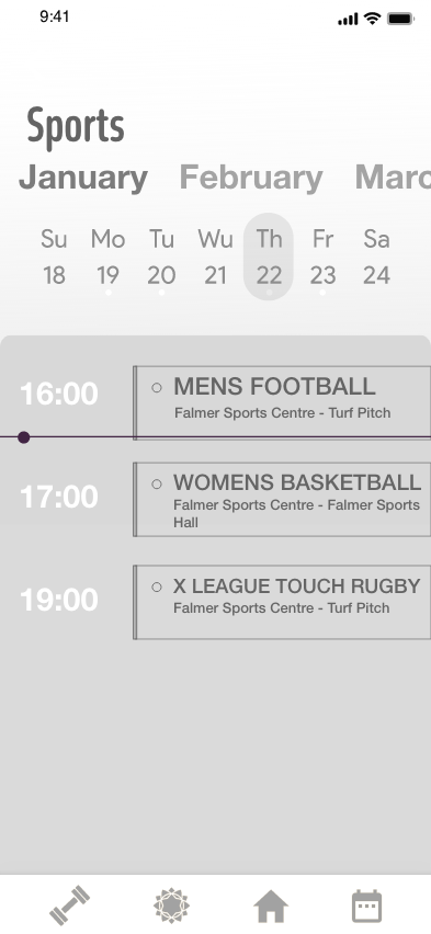
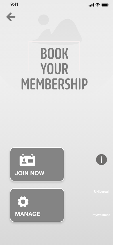
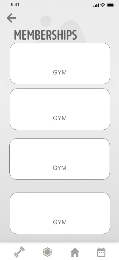
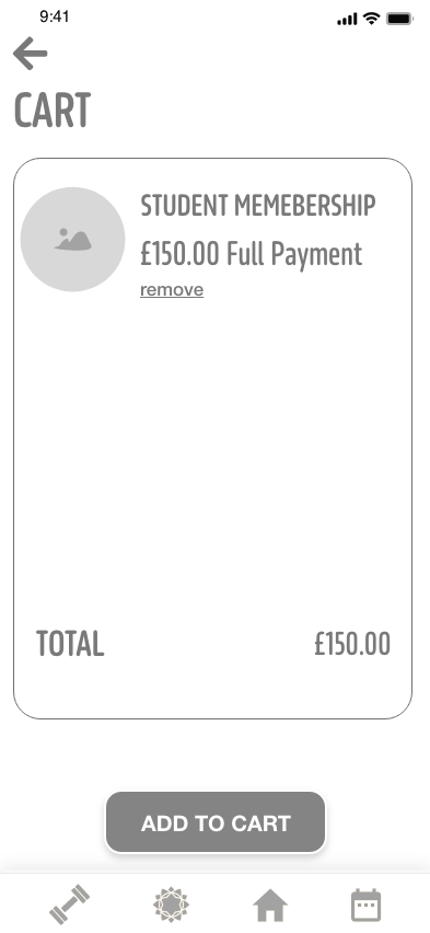
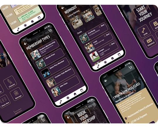
These wireframe concepts outline key screens planned for the Sport Brighton App: login, homescreen, booking hub, timetable, activity showcase, cart, gym memberships, and workouts. The addition of a navigational bar enhances access to essential pages. This process streamlines activity booking, improving visibility and overall user experience for easier navigation.
UPDATED SCREENS
Design
Improved Flow
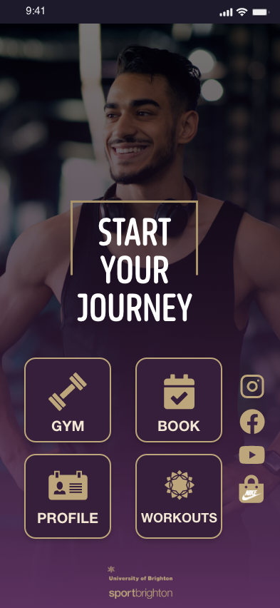
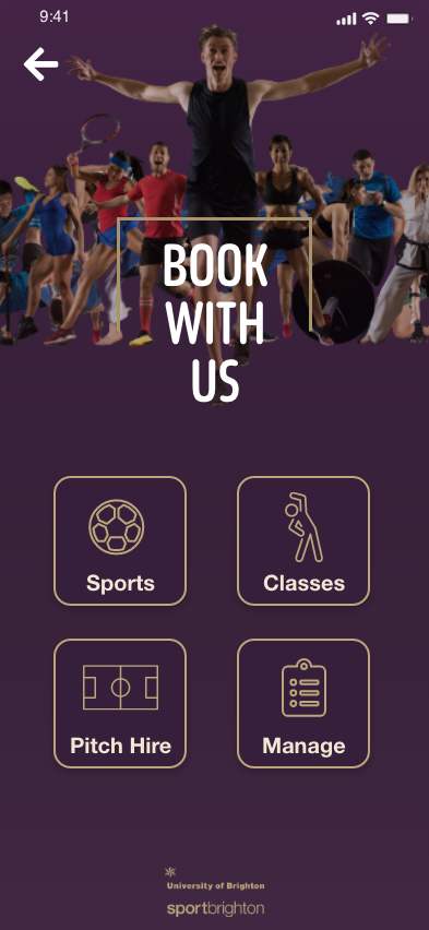
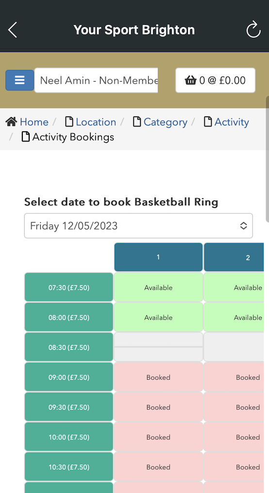
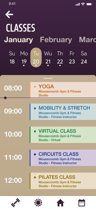
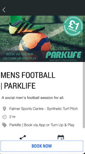
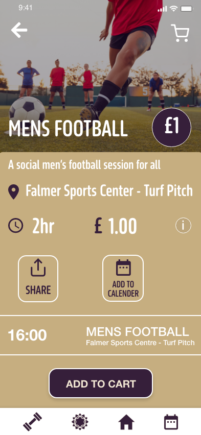
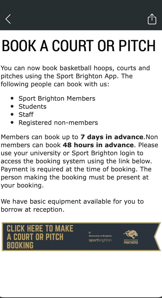
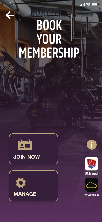
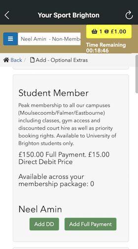
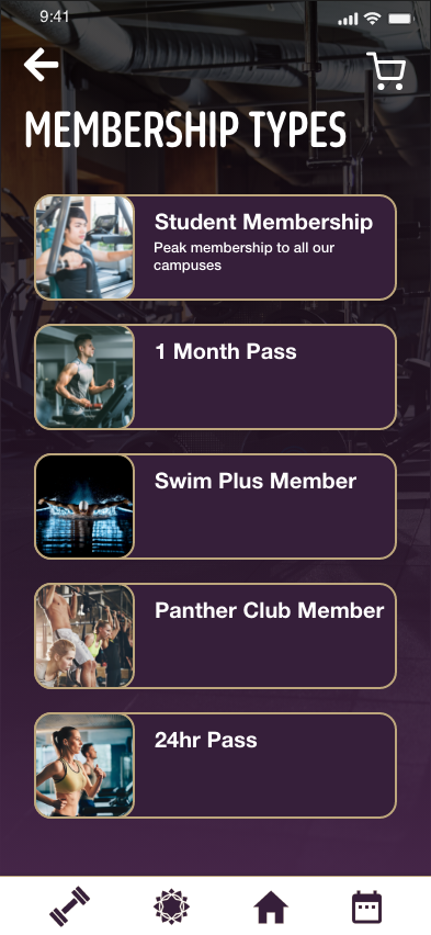
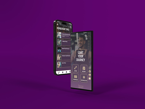
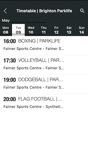
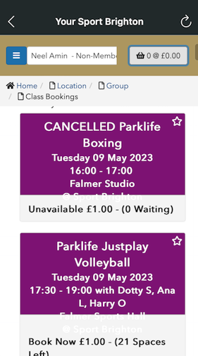
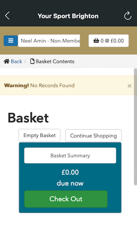
Resolved user issues in the gym membership booking process by simplifying steps and enhancing clarity. The redesign ensures a direct path for membership selection and includes an informational pop-up for additional details. For sports activity bookings, streamlined the process to four screens, improving user flow and eliminating redundancy. Additionally, revamped initial colours for improved text visibility, addressing user concerns and refining overall usability.
Before


After

